1 // PROJECT
This project was developed for a confidential startup operating in the event ticketing and Web3 space. The company's mission is to create a more transparent and equitable ticketing ecosystem while enhancing the user experience through NFT-based tickets that can be collected, transferred, and easily managed by everyday users.
Due to confidentiality requirements, the client name and identifying information have been omitted. The following case study highlights the design challenges, user-centered solutions, and product strategy behind the project.
02 // WIREFRAME
Based on user needs and insights gathered during collaborative workshops, we designed the wireframes for both the application and the website's desktop and mobile versions.
The wireframing process focused on translating user requirements into intuitive user flows and clear information architecture, ensuring a seamless experience across all platforms.
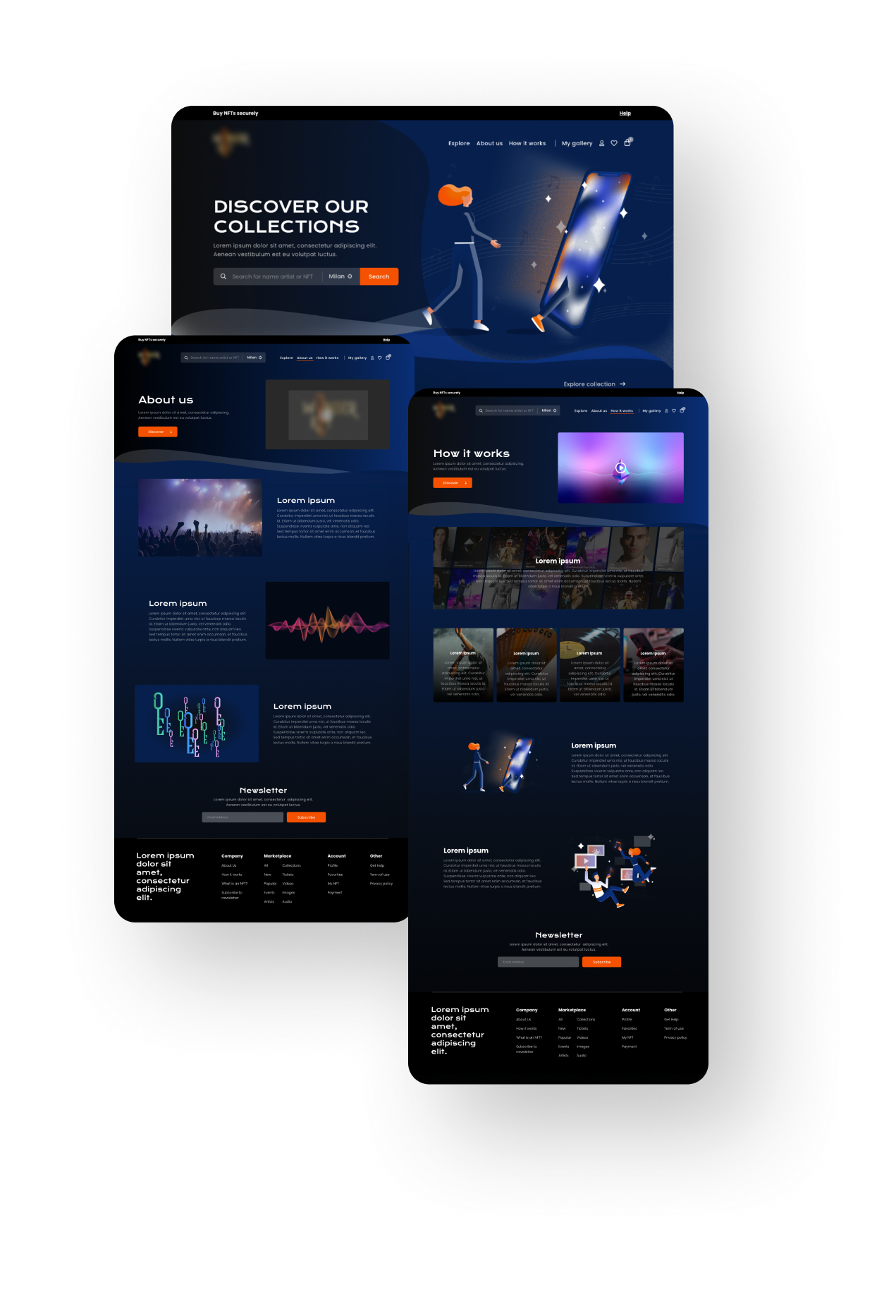
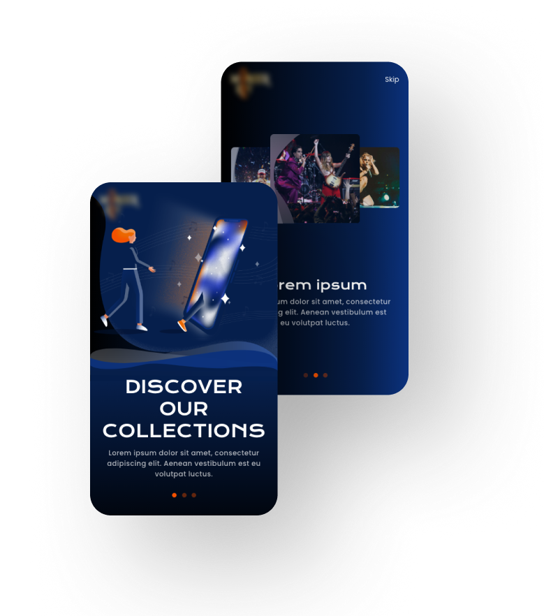
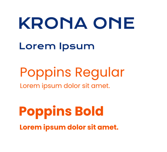
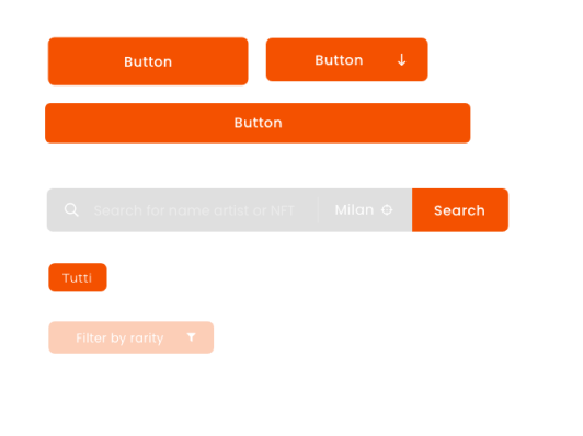
03 // VISUAL IDENTITY IMPLEMENTATION
A pre-defined visual identity had to be integrated into both the website and the mobile application.
Our goal was to preserve the brand guidelines while adapting them to the requirements of digital products, with particular attention to readability, accessibility, and usability.
To modernize the visual language, we introduced flowing graphic lines inspired by contemporary audio equalizers, combined with layered layouts and overlapping elements to create depth and dynamism. We also replaced some of the original typefaces with web-optimized alternatives to improve legibility across devices. For imagery, we opted for custom-made illustrations that reinforced the brand's personality while ensuring visual consistency throughout the experience.
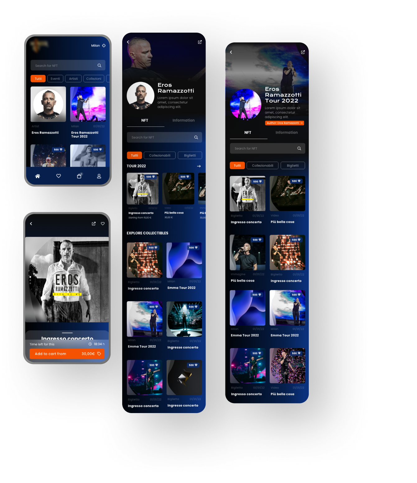
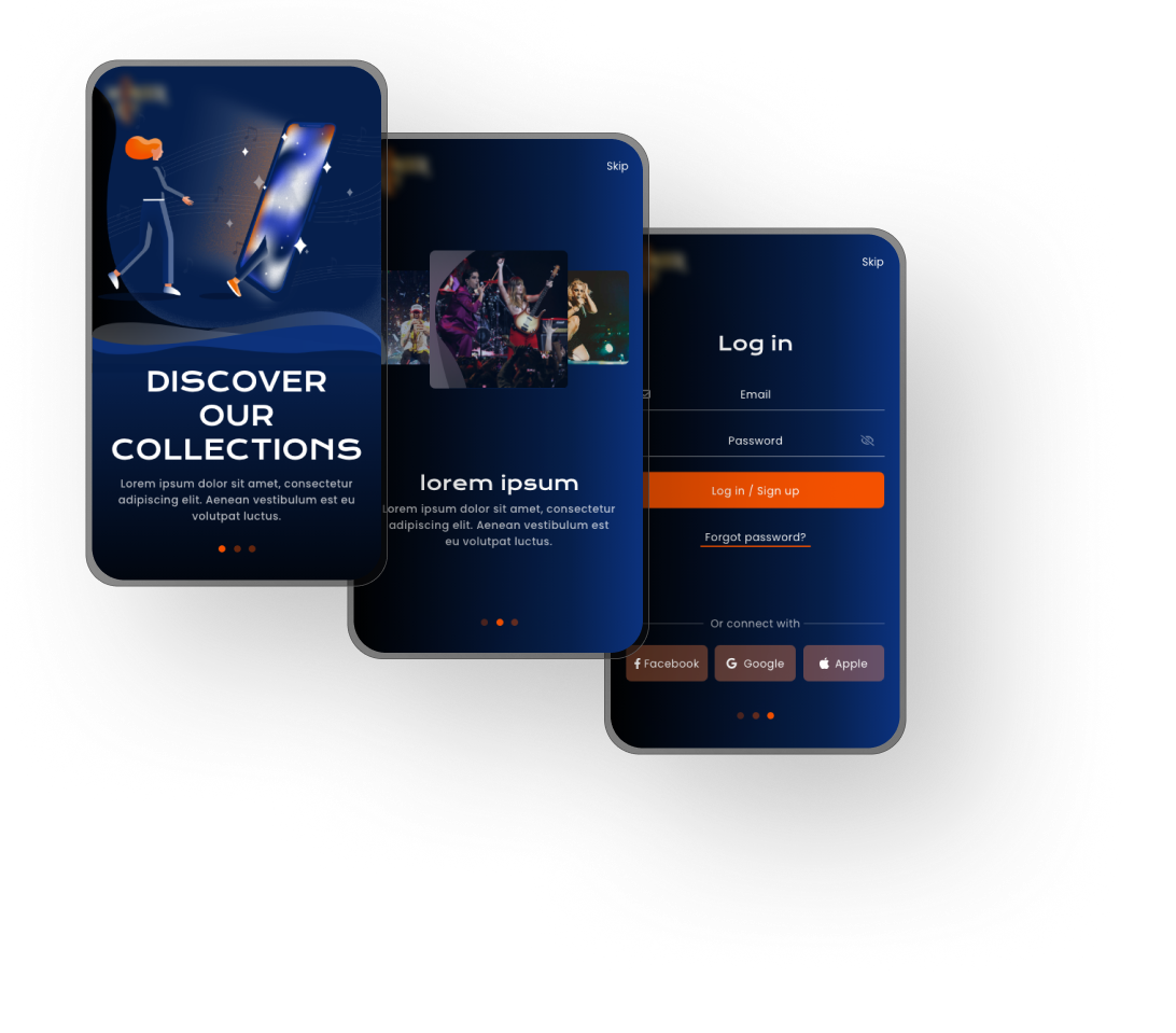
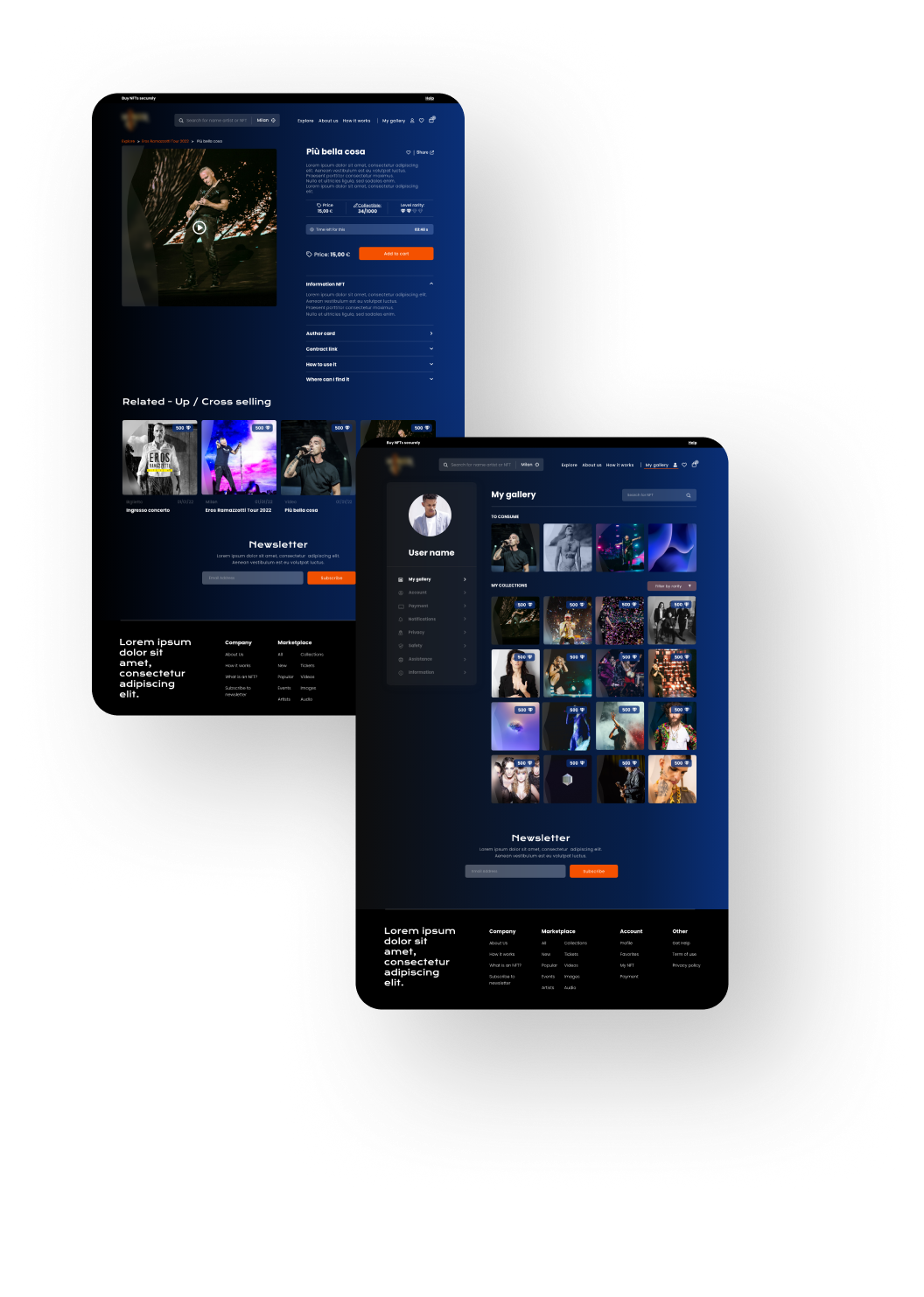
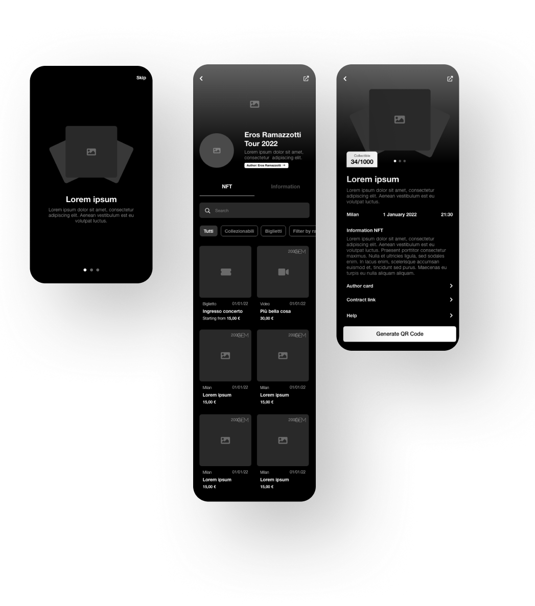
04 // MOCKUPS & USABILITY TESTING
Once the visual identity was integrated into the wireframes, high-fidelity mockups were developed for both the website and the mobile application.
To validate the design, we conducted a series of usability tests with potential users. Participants were asked to complete key tasks, such as browsing upcoming events, purchasing tickets, accessing their digital tickets, and exploring NFT-related features.
The tests highlighted the need for clearer navigation labels and a more prominent call-to-action during the ticket purchasing process. Based on user feedback, we refined the information hierarchy, simplified some interaction flows, and improved the visibility of primary actions.
We also carried out accessibility and responsiveness reviews across different screen sizes to ensure a consistent experience on desktop, tablet, and mobile devices.
The final mockups incorporated these improvements, resulting in a more intuitive, accessible, and user-friendly product experience.