01 // PROJECT OVERVIEW
Designing an Accessible Experience for Neurodiverse Users
A maze is traditionally a place where finding the right path is difficult. Our vision for Il Laribinto was the opposite: creating a digital space where information is easy to find and where users can feel understood, supported, and empowered.
Starting from the existing website of Il Laribinto, an association dedicated to supporting people with Specific Learning Disorders (SLD), the project aimed to redesign the platform with accessibility and inclusivity at its core.
Through clear content organization, accessible visual design, and highly legible typography, the new experience was designed to help every user confidently find the information and resources they need.
Role
UX Research
Information Architecture
Wireframing
Accessibility Design
UI Design
Front-End Development
02 // USER RESEARCH & USER STORIES
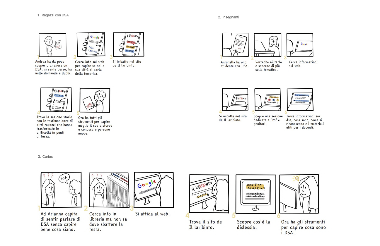
To better understand user needs, motivations, and expectations, we identified three primary target groups:
1. Young People with SLD
Users looking for information, support, and practical resources to help manage learning challenges.
2. Parents & Education Professionals
Parents, teachers, and educators seeking guidance, tools, and reliable information.
3. General Audience
People interested in learning more about Specific Learning Disorders and neurodiversity.
To visualize user needs and potential navigation paths, we created a series of user stories and storyboards that helped define key scenarios and design priorities.
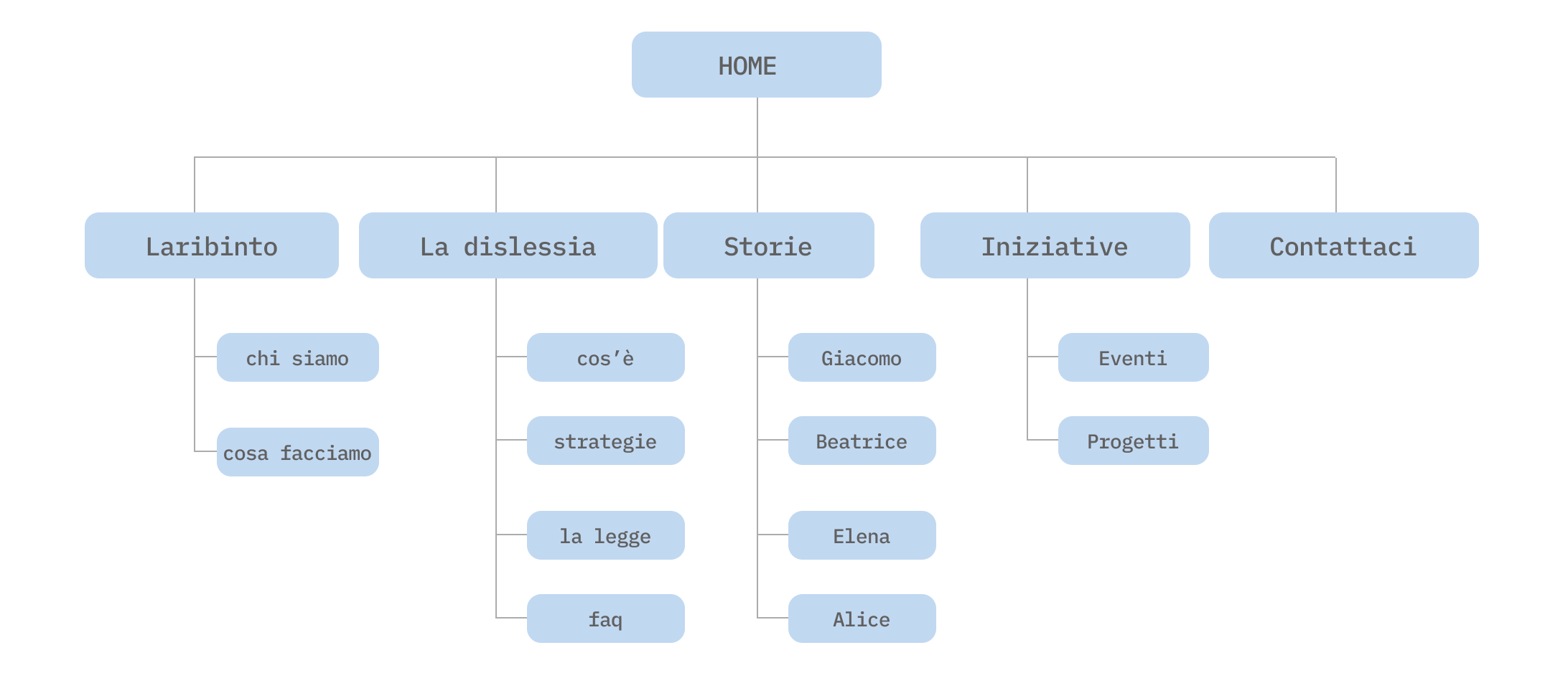
03 // INFORMATION ARCHITECTURE & USER FLOW
An audit of the existing website revealed a large amount of fragmented content and several navigation issues that negatively affected the overall user experience.
To improve clarity and content discoverability, the information architecture was redesigned and simplified by:
Removing redundant sections
Renaming unclear navigation labels
Improving content hierarchy
Creating more intuitive navigation paths
Two new sections were introduced:
Stories
A dedicated space for testimonials and experiences shared by people with SLD.FAQ
A centralized area designed to answer common questions and provide accessible information.
The resulting architecture established the foundation for a more intuitive and inclusive user experience.
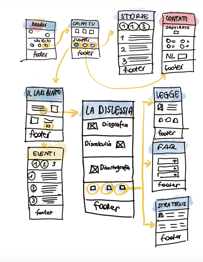
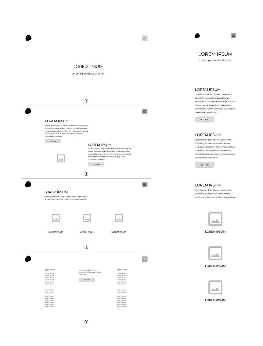
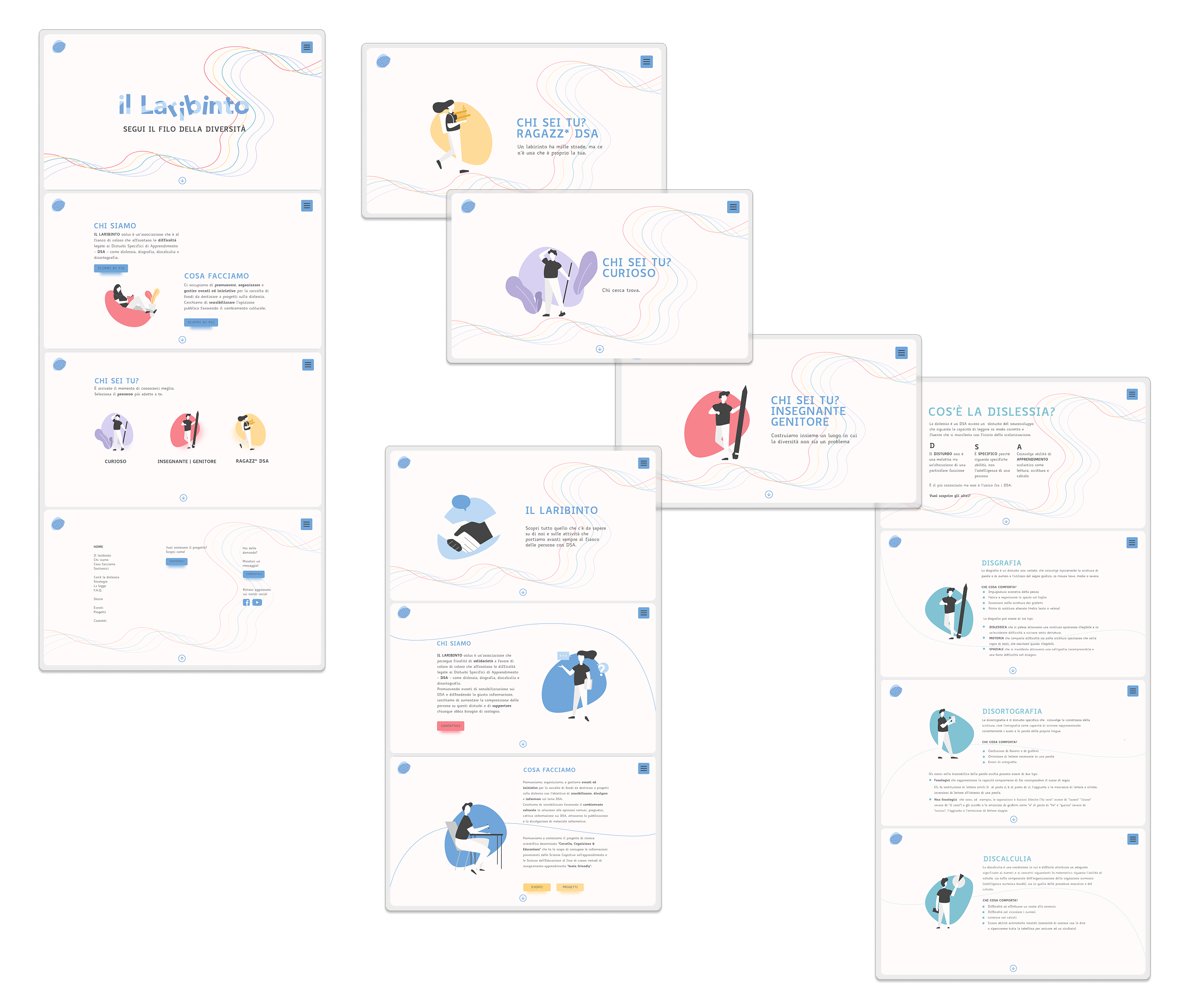
04 // WIREFRAMES
The wireframing phase focused on transforming the new information architecture into intuitive and accessible interfaces.
Special attention was given to reducing cognitive load, improving content discoverability, and supporting users throughout their navigation journey.
To facilitate access to related content, contextual shortcuts were introduced across the website, while a persistent navigation menu ensured that every section remained easily accessible at all times.
The wireframes served as the basis for validating navigation patterns and page hierarchy before moving into visual design.
05 // ACCESSIBILITY SYSTEM
Accessibility was the guiding principle throughout the entire project.
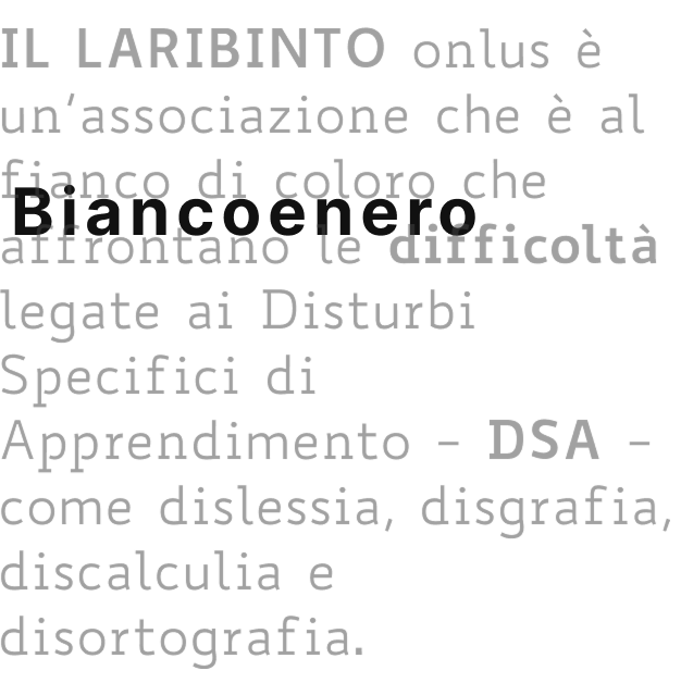
Typography
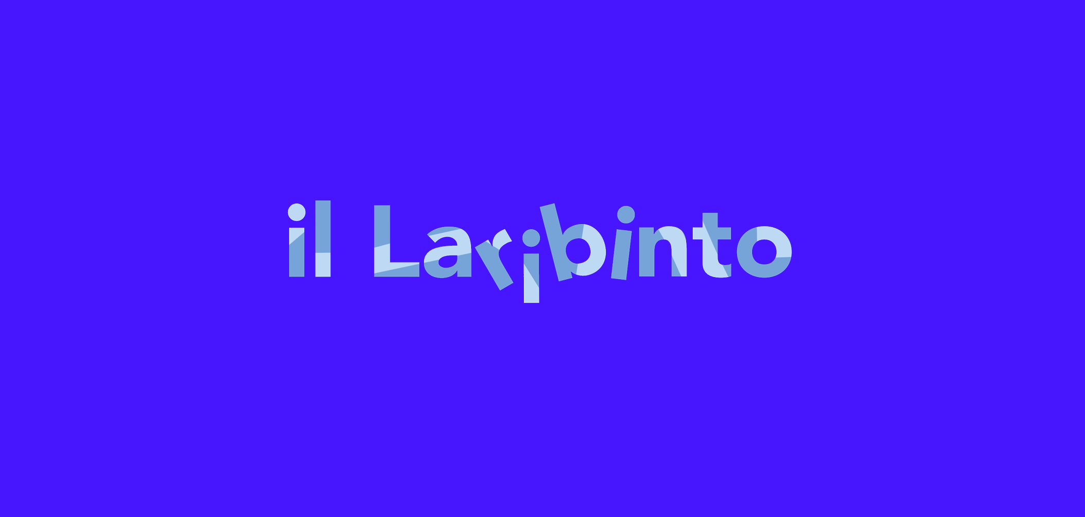
The project adopted Biancoenero®, the first Italian typeface specifically designed for high readability and accessibility.
Its distinctive letterforms reduce visual ambiguity and improve character recognition, particularly for users with dyslexia and other Specific Learning Disorders.
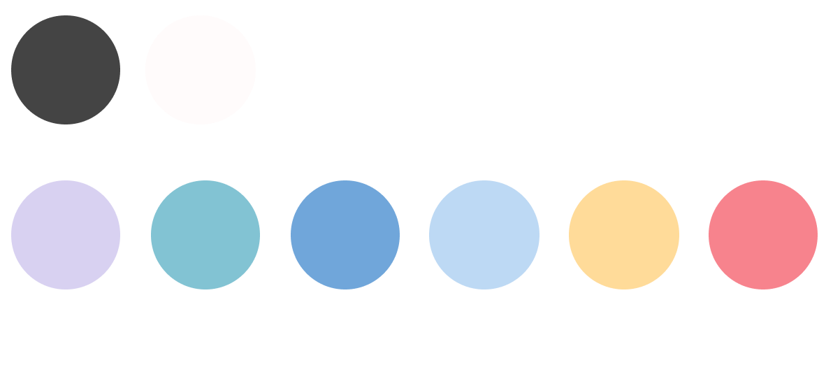
Color Palette
The visual system was designed to maximize readability and visual comfort.
Pure black and optical white were intentionally avoided in favor of softer tones that reduce visual fatigue while maintaining accessibility-compliant contrast ratios.
Together, typography and color created a more inclusive reading experience for all users
TYPOGRAPHY
Particular attention was given to typography, ensuring that individual letterforms were easily distinguishable from one another. This is especially important for mirrored characters such as b–d, p–q, and a–e, which can be challenging for users with learning disabilities.
Characters that often appear visually similar in conventional typefaces—such as l and I, or m and n—were designed to be more clearly differentiated.
To improve readability at small sizes (below 8 pt), the height of capital letters was aligned with the height of ascenders, increasing overall legibility and visual clarity.
06 //VISUAL DESIGN & MOCKUPS
The visual identity was redesigned to better reflect the association's mission and values.
The new system included:
Updated logo
Accessible color palette
High-legibility typography
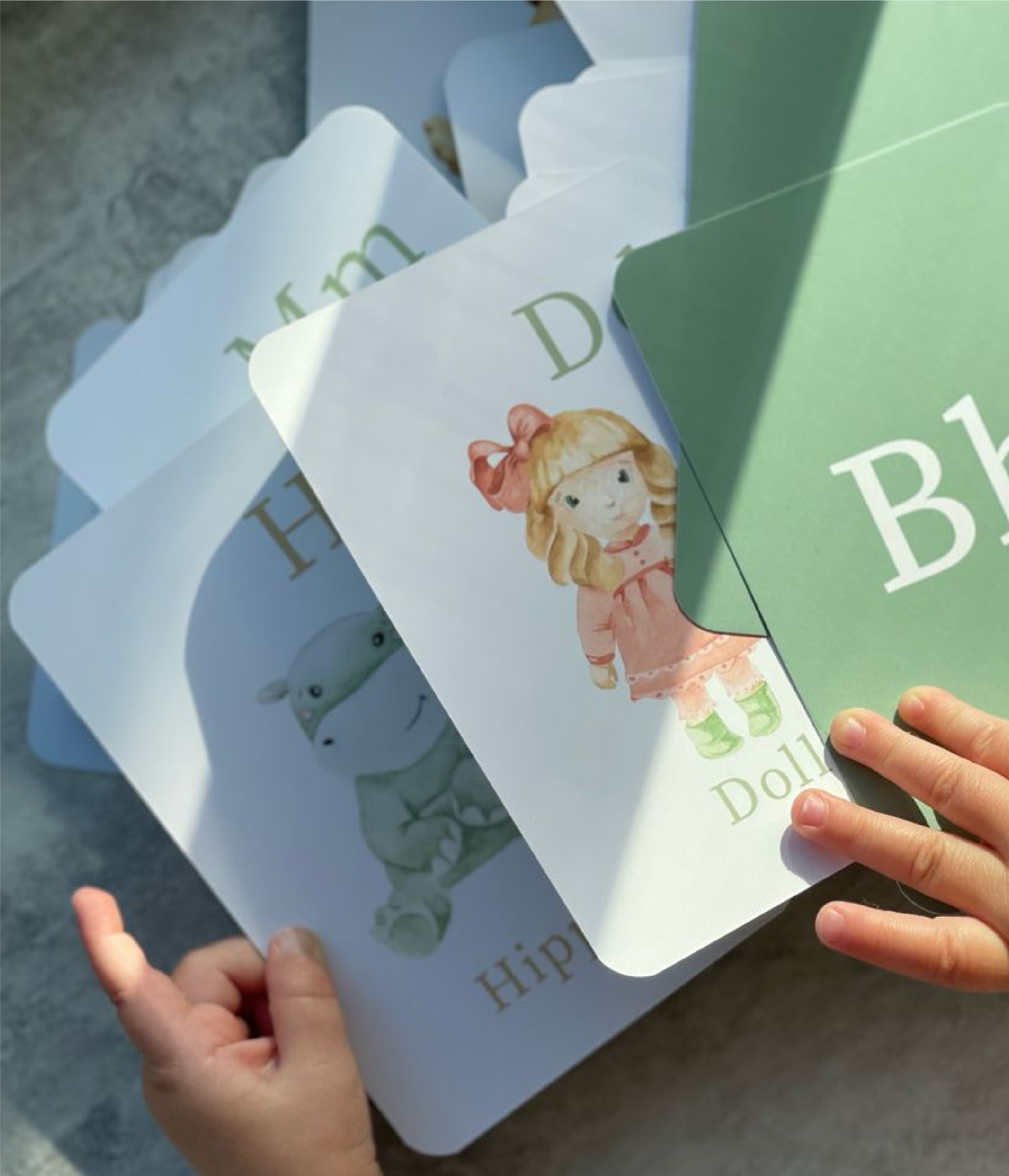
Custom illustrations
In addition to the visual redesign, new content was developed to support the updated structure, including real stories and testimonials from people with SLD.
Responsive mockups were created for desktop, tablet, and mobile devices, establishing the visual foundation for development..
06 // DEVELOPMENT & IMPLEMENTATION
The final phase focused on translating the approved designs into a fully responsive and accessible website.
Using Bootstrap, the interface was developed to ensure consistent performance across desktop, tablet, and mobile devices while preserving the accessibility principles established during the design process.
Particular attention was given to:
Responsive layouts
Readability
Navigation consistency
Accessibility standards
The result was a platform designed to support a diverse audience through a clear, inclusive, and user-centered digital experience.