UX Research, Discovery & User Flow Design
Responsibilities
UX Research
Discovery
Competitive Analysis
User Interviews
User Flows
Information Architecture
Wireframing
Usability Testing
01 // PROJECT OVERVIEW
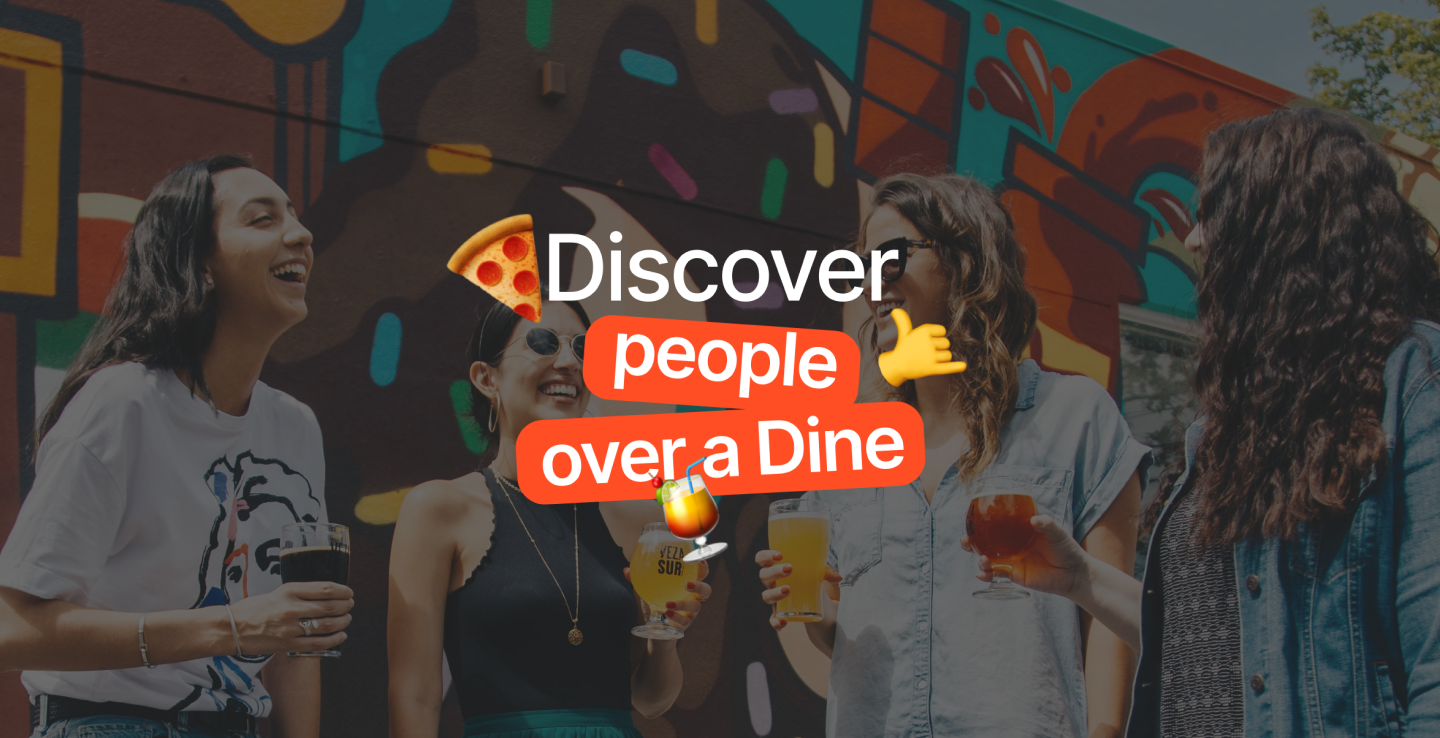
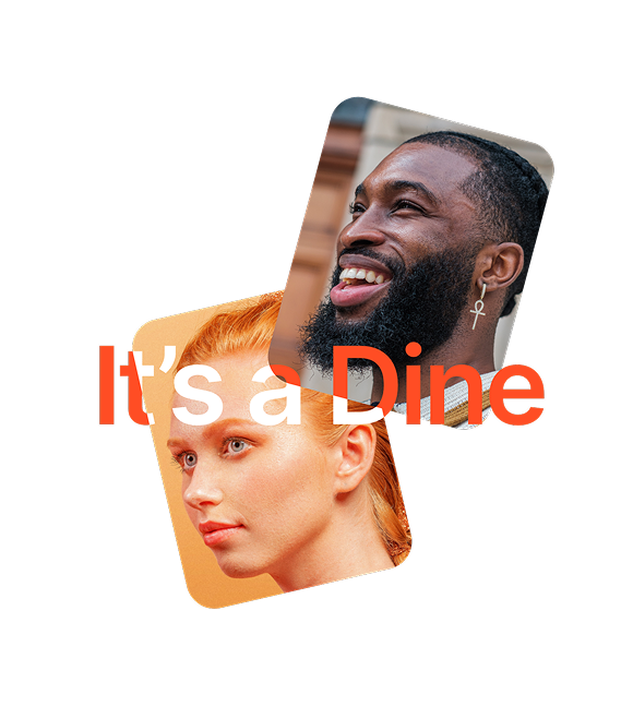
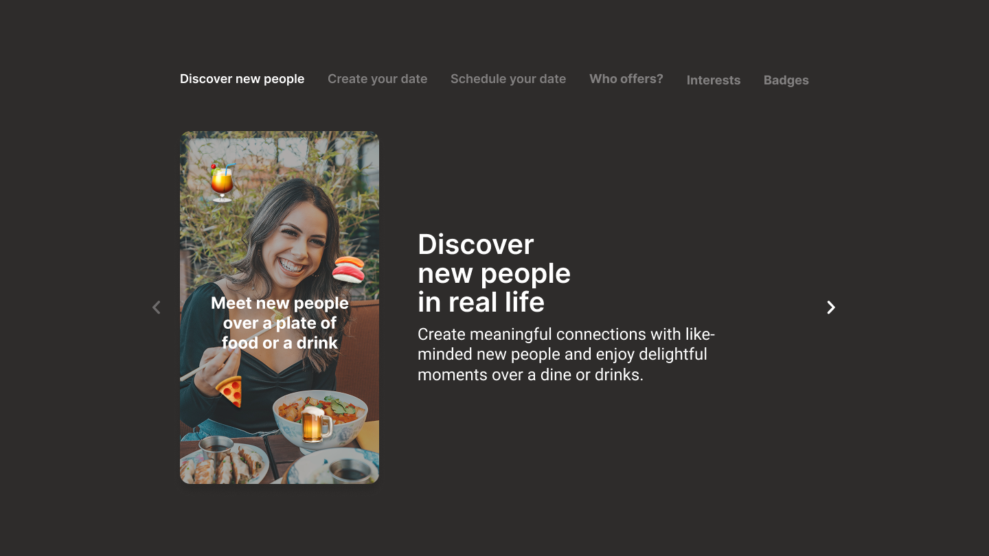
DineMe is a social dining platform designed to connect people through shared food experiences. By combining restaurant discovery, social networking, and event creation, the app enables users to meet new people in a more natural and structured environment than traditional dating applications.
The project aimed to create a safe, inclusive, and trustworthy experience while reducing the friction commonly associated with organizing first-time meetings.
As part of the Havas CX team, I contributed primarily to the Discovery and UX Design phases, focusing on research, user journeys, onboarding, event creation flows, and usability validation.
02 // CHALLENGE
Designing a platform that combines social interaction, restaurant discovery, and real-world meetings introduced several UX challenges:
Building trust between strangers.
Creating an inclusive experience for diverse user groups.
Reducing anxiety associated with meeting new people.
Balancing detailed onboarding with low registration friction.
Defining clear event creation and participation flows.
Encouraging meaningful connections beyond appearance-based interactions
03 // DISCOVERY & COMPETITIVE ANALYSIS
Benchmark Categories
Dating Apps
Tinder | Bumble | HingeRestaurant Discovery
TheFork | Tripadvisor | Google Maps
Research Goals
Understand onboarding best practices.
Analyze trust and safety mechanisms.
Evaluate matching and discovery patterns.
Study event creation experiences.
Identify inclusive UX patterns.
Key Learnings
Verification strongly impacts trust.
Social proof increases credibility.
Users expect familiar interaction patterns.
Safety mechanisms influence adoption.
Flexibility is preferred over rigid matching criteria.
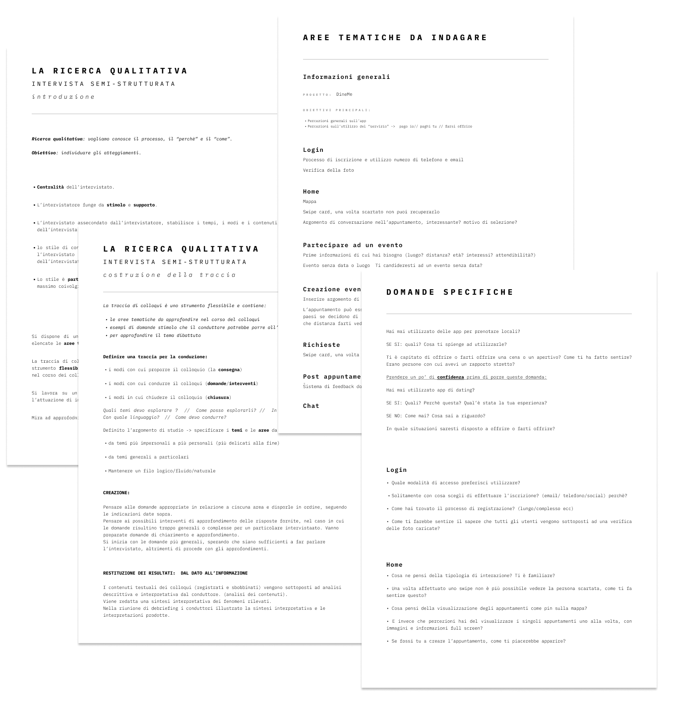
04 // USER RESEARCH
Methodology: Semi-structured qualitative interviews.
Research Objectives
Understand perceptions of online dating.
Investigate attitudes toward social dining.
Explore trust and safety concerns.
Validate onboarding assumptions.
Evaluate reactions to feedback systems.
Key Insights
Trust comes before matching
Users were more likely to engage when profiles were verified and connected to external social accounts.
Safety reduces anxiety
Photo verification, badges, and transparent profile information increased confidence.
People matter more than events
Users tended to evaluate the person before the event itself.
Ratings felt dehumanizing
Participants disliked numerical ratings and preferred contextual feedback.
Flexible events were preferred
Users appreciated having predefined details while maintaining room for personalization.
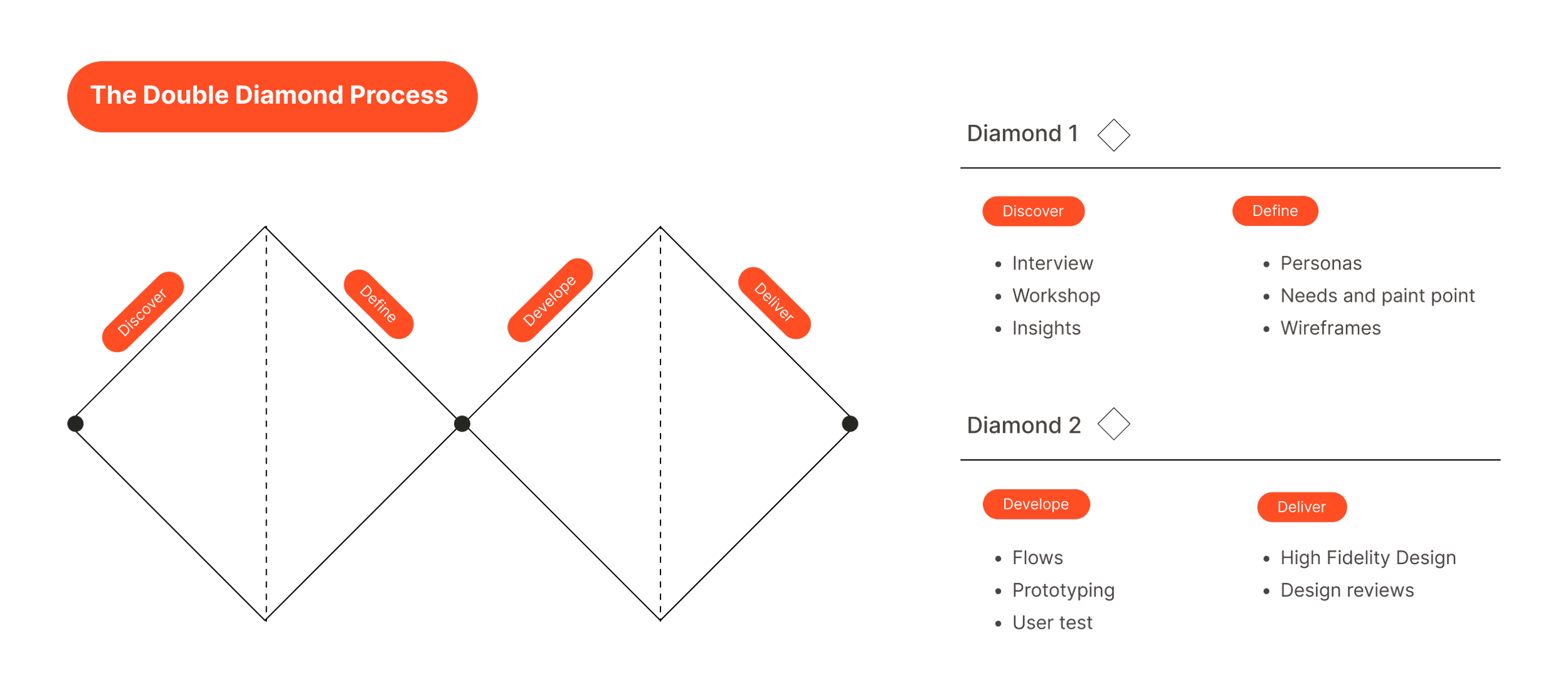
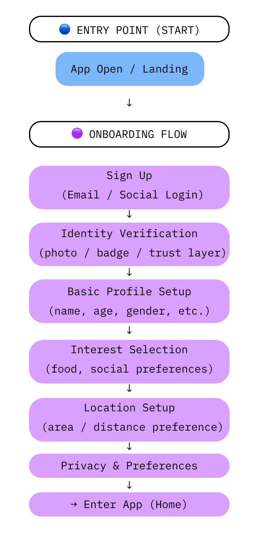
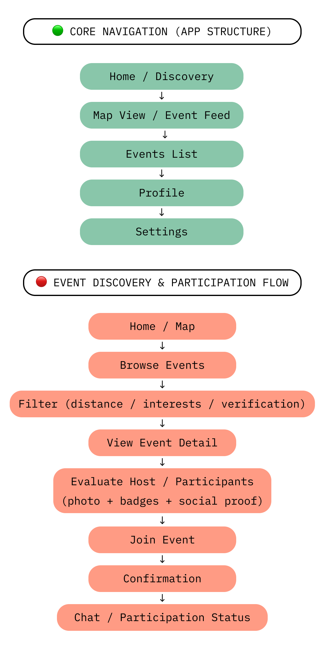
05 // INFORMATION ARCHITECTURE & USER FLOWS
This section defines the overall structure of the product and the main user flows that shape the experience.
Based on insights from user research and competitive analysis, we translated user needs into a clear product architecture designed to reduce cognitive load, build trust, and support seamless social interaction.
The system is organized into five core flows:
Onboarding flow: guiding users through registration, verification, and preference setup.
Core navigation flow: defining how users move through the main areas of the application.
Event discovery and participation flow: supporting the exploration, evaluation, and joining of social dining events.
Event creation flow: enabling users to design and publish new dining experiences.
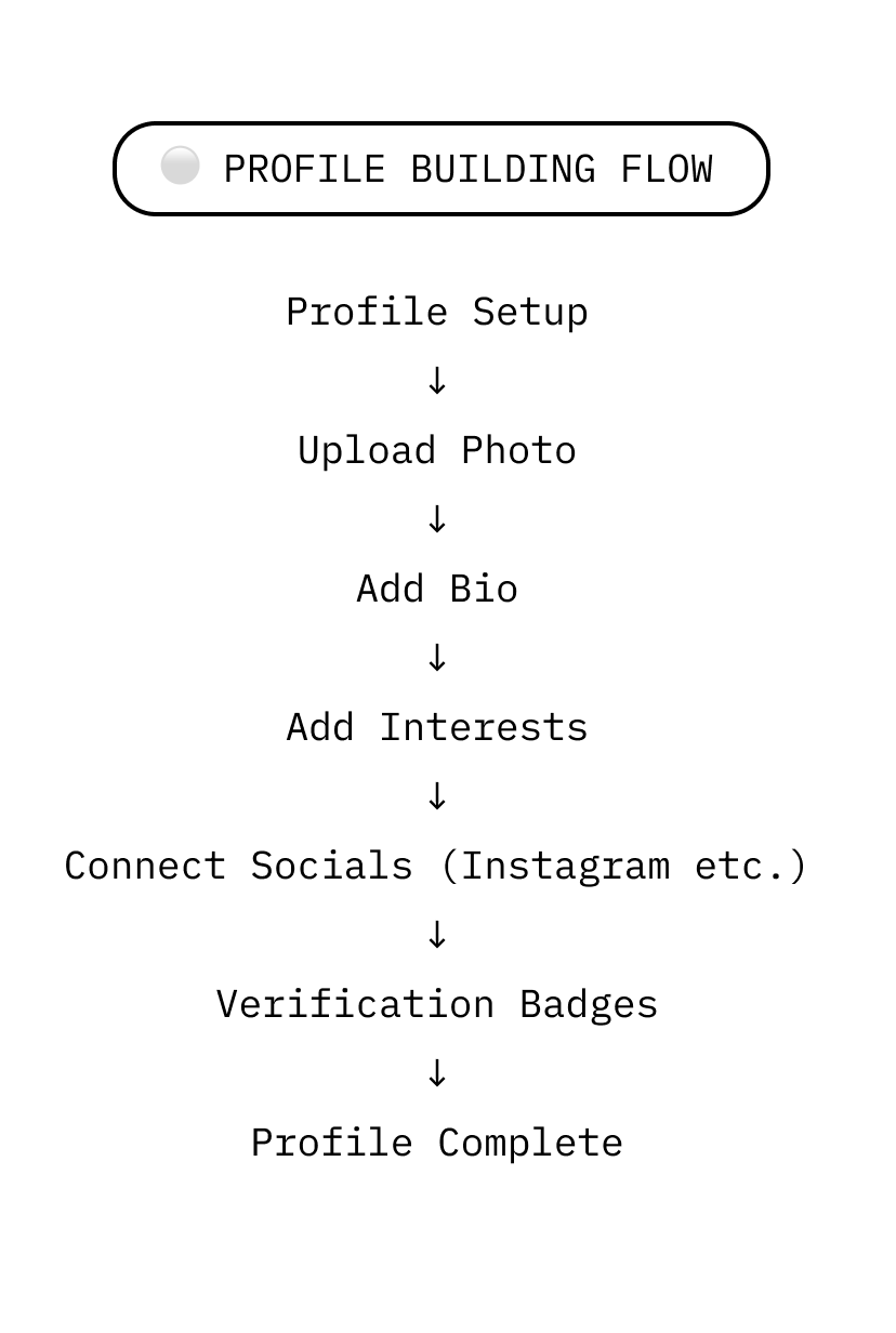
Profile flow: supporting identity building, personalization, and trust signals.
The diagram below illustrates how these flows interact within the overall product ecosystem, showing both linear journeys and branching interactions between key features.
06 // WIREFRAMING
The wireframing phase focused on translating the defined user flows into high-fidelity, testable prototypes.
The objective was not only to validate structure and navigation, but also to evaluate interaction patterns, iconography, and early interface behaviors before the final UI was designed.
These wireframes included key visual and interactive elements, allowing users to experience realistic scenarios during usability testing sessions. This approach helped gather more accurate feedback on both functional clarity and interaction design.
Given the collaborative nature and scale of the project, the wireframing effort focused on selected high-impact areas of the product that were assigned during the design process.
The following section includes a selection of representative screens used during testing to illustrate core interaction patterns and design decisions.
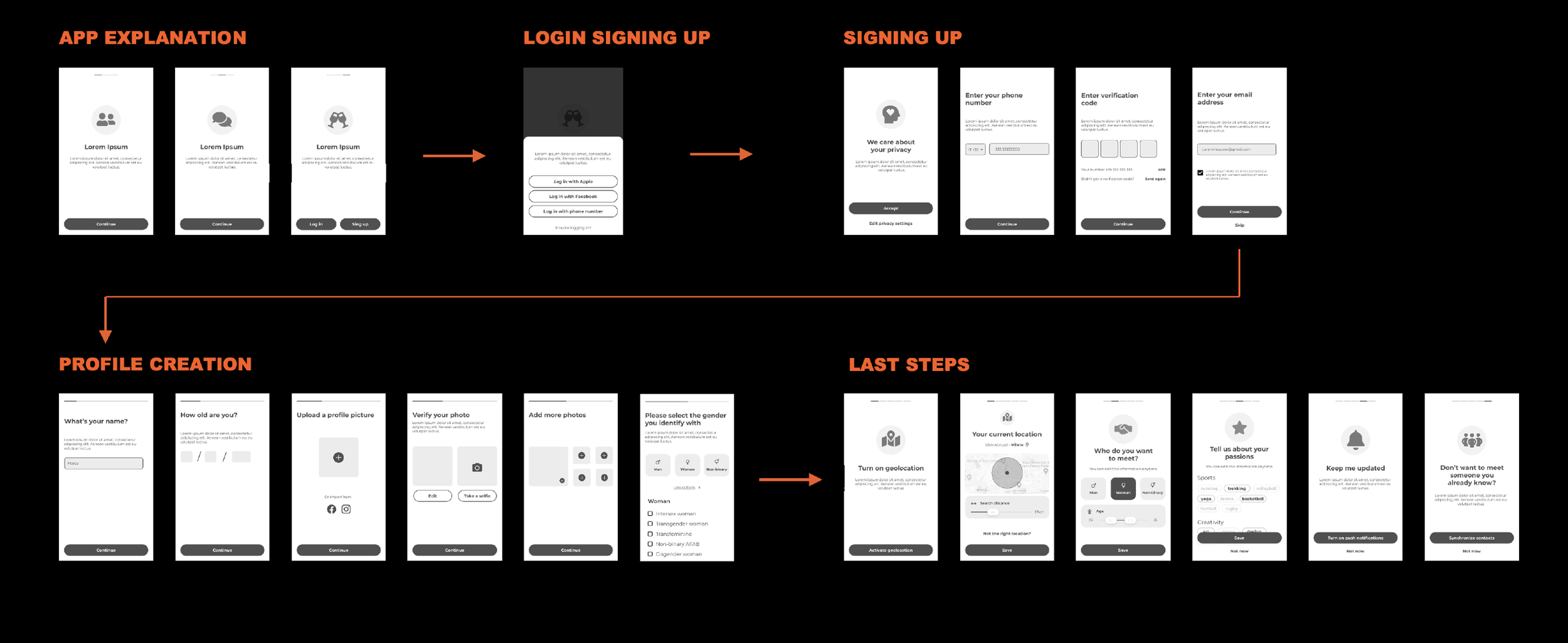
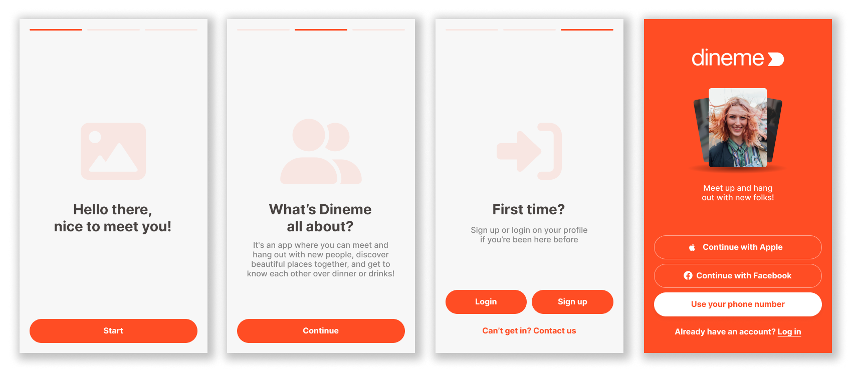
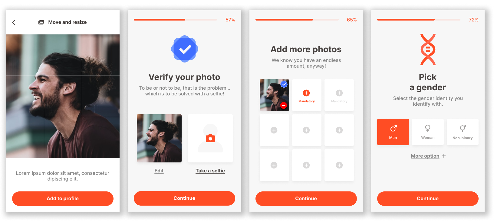
SING UP //
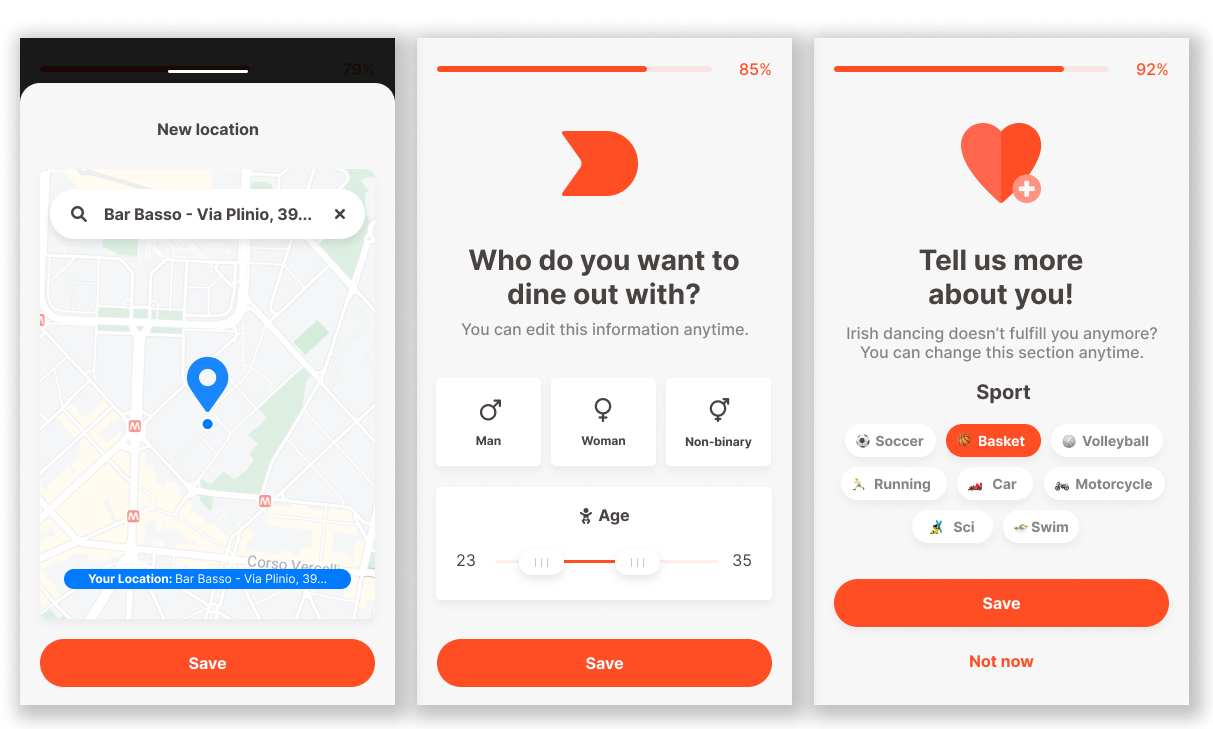
PROFILE SET UP //
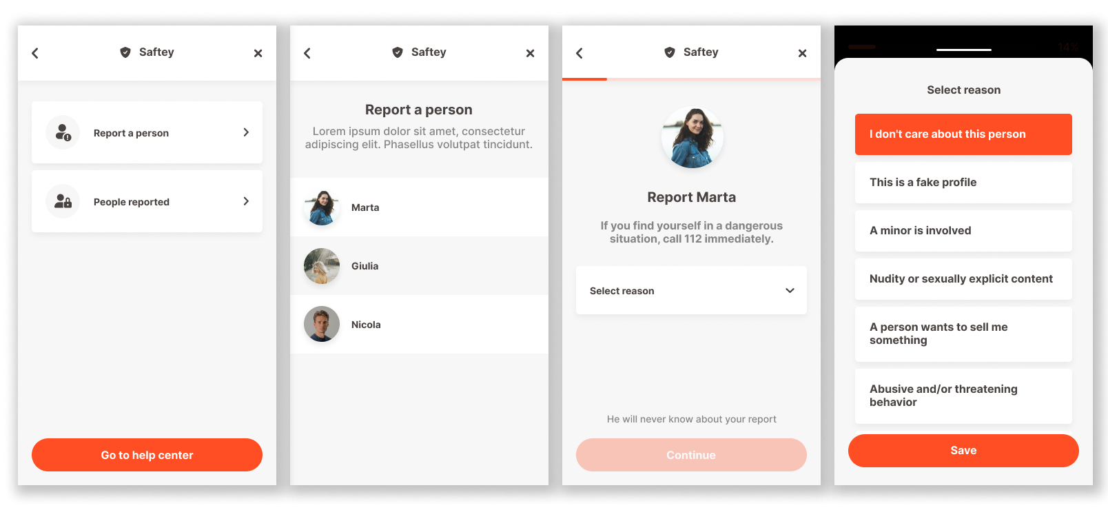
REPORT A PERSON //
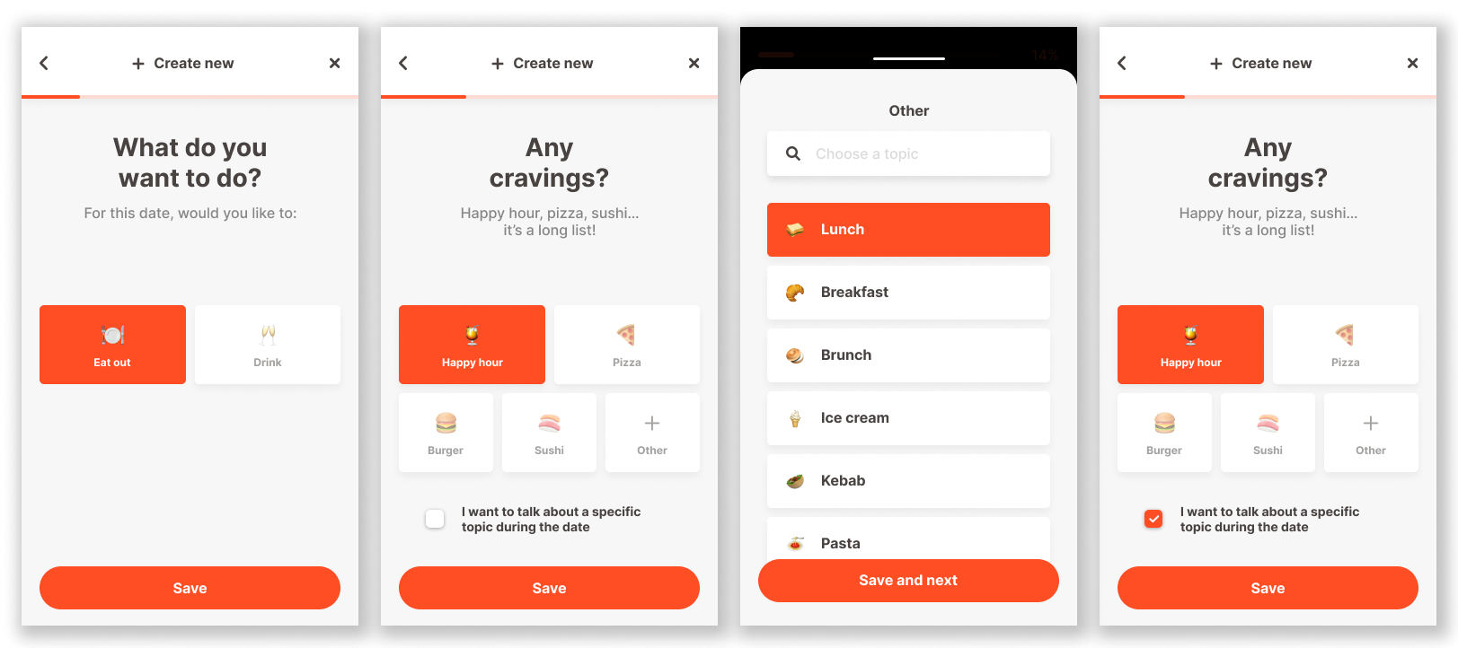
NEW EVENT //
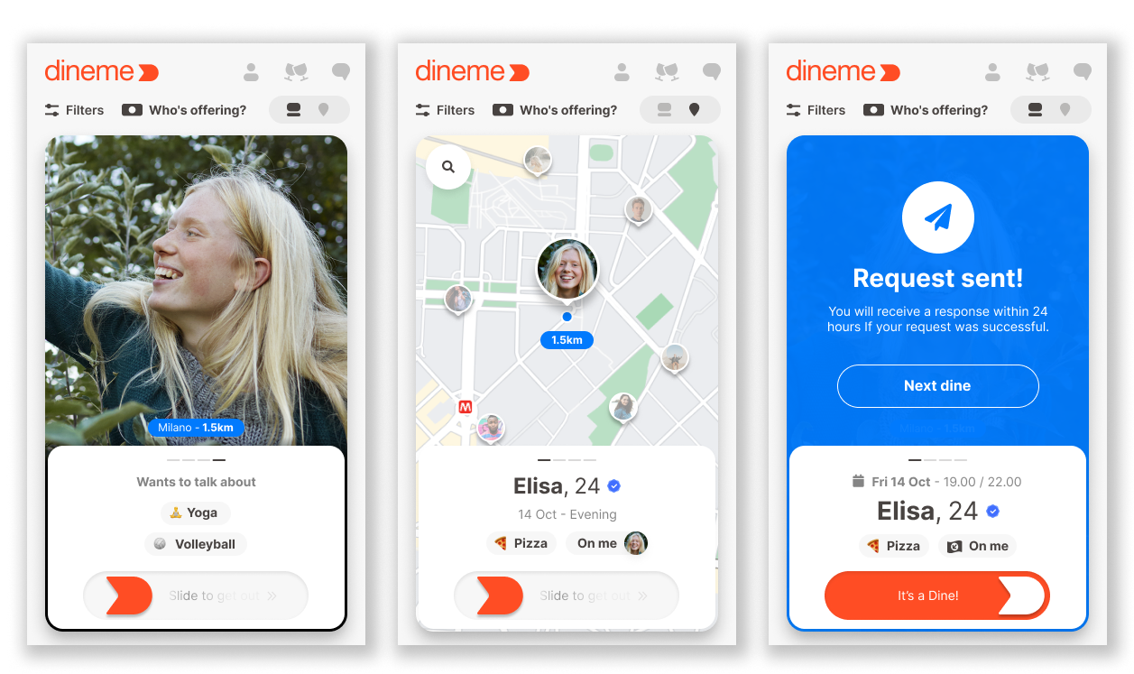
EVENT PAGE // SEND REQUEST
07 // USER TEST
To validate the usability of the high-fidelity prototypes, we conducted moderated usability testing sessions with representative users.
Participants interacted autonomously with the interface while being encouraged to think aloud, verbalizing their expectations, emotions, and decision-making processes throughout the tasks.
The goal of the sessions was to evaluate the clarity of key user flows, interaction patterns, and the overall comprehensibility of the system before final UI implementation.
USER TEST
〰️
USER TEST 〰️
Test Methodology
Moderated usability testing
Think-aloud protocol
Task-based evaluation
Focus on onboarding, event interaction, and trust & safety flows
Participants
The study involved 5 users aged 24–38, with mixed experience in digital products:
3 frequent users of social or dating platforms
2 occasional users of event or booking apps
Test Tasks
Participants were asked to:
Register and complete their profile
Create a new event
Report a user profile
Discover and join an event
Evaluate a profile based on trust signals
Key Findings
Onboarding length perceived as slightly long (3/5 users), despite clear structure
Trust signals needed more explanation (3/5 users)
Event creation felt slightly complex due to multiple options (3/5 users)
Reporting feature was not immediately visible (4/5 users)
Irreversible actions caused hesitation (4/5 users)
Iterations
Based on these insights, we focused on:
improving onboarding clarity and progression
clarifying trust and verification elements
simplifying event creation flow
increasing visibility of reporting actions
adding confirmation states for critical actions
08 // COLLABORATION
This was a multidisciplinary project involving UX, UI, Branding, and Product teams.
My contribution focused on:
Discovery
Competitive Analysis
User Research
User Interviews
User Flows
Information Architecture
Wireframing
Usability Testing
The visual identity and final UI design were developed by other members of the design team.
I left the agency before the final release of the product; however, the research findings, user journeys, and wireframes produced during the discovery phase informed the subsequent design and development work.